
10/30 people liked this design best because they were able to see the artists features without the shot being too close like Design 2. -This was useful as i discovered a lot of my audience prefer mid-shots on the front of album covers as appose to a close up because they felt the cover looked too 'crammed'. They thought that being able to see the artists face and features are important as you immediately know who's album it is when on the shelf. I have taken this into account and like the idea of being able to see the artist, so it is likely that I will use this as my front cover, as it was joint most popular with Design 5.
Design 2
Only 1 person out of the 30 people I asked voted this as the best one, the general consensus of opinion was that you can see the artist and you can see him clearly, however the image is 'too close' and doesn't look as effective as the others.
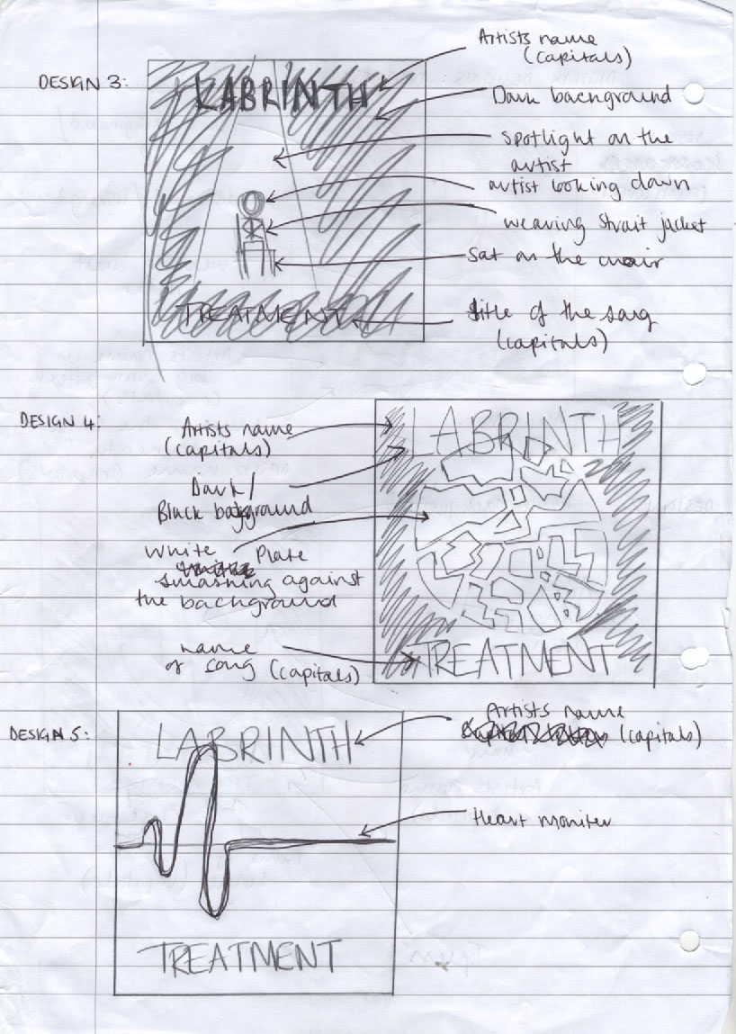
Design 3
Only 2 people voted this cover as their favourite because they thought that you wouldn't be able to see the artist clearly, however, a lot of them also said that they wouldn't choose it as a front cover, but if they had to choose one to be used as the back image of the digi-pac, then that would be their favourite choice as they think that a different shot of the front cover image would be effective (the front cover being a mid-shot and the back being a long-shot). At the time before asking my audience about the front cover, I had not thought about the back of the digi-pac, but now I think that I will take note of what thy have said and use this for the back image. I found the feedback for this CD cover particularly useful, not only because it help me decide on what design to use for the back of the digi-pac, but also because I now know that when I do use it, my audience have chosen it and I like it too.
Design 4
7 out of the 30 liked this design because they thought that it was effective and expressed the artists anger that he experiences in the music video.. They thought that the white plate on the black background was attention grabbing and said that they had 'never seen a cover with something like that on before'.
Design 5
This was the joint favourite with the first design, the audience thought that it was 'simple yet effective' and it had many responses saying it looked 'cool' because it wasn't the same as most covers and it's very rarely that you see a CD cover that isn't the artist posing. The audience said that they liked the effect of the heart beat monitor because it was also dramatic as you can see that his heart has stopped, implying it is broken, which relates to the song.
In conclusion.. I have decided that the first design is going to be the front cover of the digi-pac as it was one of the audiences favourites, not only that, I have also decided that the image inside the digi-pac and on the back will be selected from these designs. This is because the feedback that I collected was that informative and showed many opinions, however they were all similar, which has now made me believe by selecting three of these designs, I will produce a professional looking, eye-catching digi-pac that the public would want to buy if it were on a shelf in a shop!
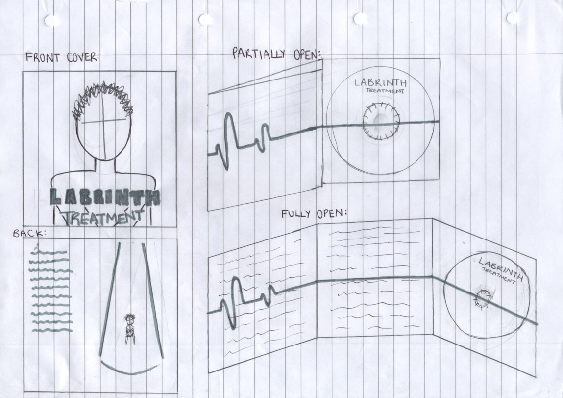
I have decided that the design I will use for the inside of the digi-pac will be design number 5 which will represent the artists heart flat-lining after it has been 'broken'.
This image will not only be on the inside of the digi-pac but will also be on the CD itself, which will just be a straight line across the CD.
On the the back of the digi-pac I will use design 3, however instead of having the artist in the middle he will be positioned to the left hand-side (as you look at the digi-pac) and the songs will be on the right hand-side (as you look at it).
The digi-pac will open once and then again (as shown on the design diagram below) on the inside of the digi-pac when it is fully open the design will still be the same as design 5 however will have all of the record company's information on the right side (as you look at it) and who the artist wants to thank and his message to his fans on the left.
Digi-Pac Final Design:
No comments:
Post a Comment