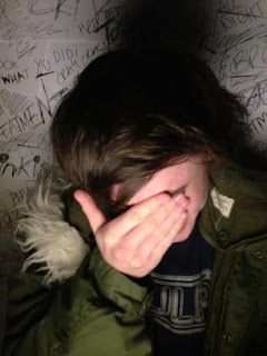
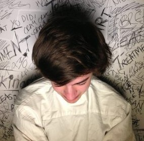
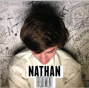
Front Cover of DigiPac:
With the help from Rachel, the plain wall slowly became the background for the front cover of my digipak. It started off with a wad of paper, two black marker pens, a plain wall and some bluetack. To get this background I had to make it. I did this by blue tacking the paper to the wall, then with the help of Rachel, we scribbled all over it, writing down some of the lyrics until it was completely covered.


I then got a spot light and positioned it infont of where the artist would be stood. When he arrived I took a few tester shot photos to check how it looked, then he got changed into his costume and got the main image I am not using for the front cover of the digipak.

Text:
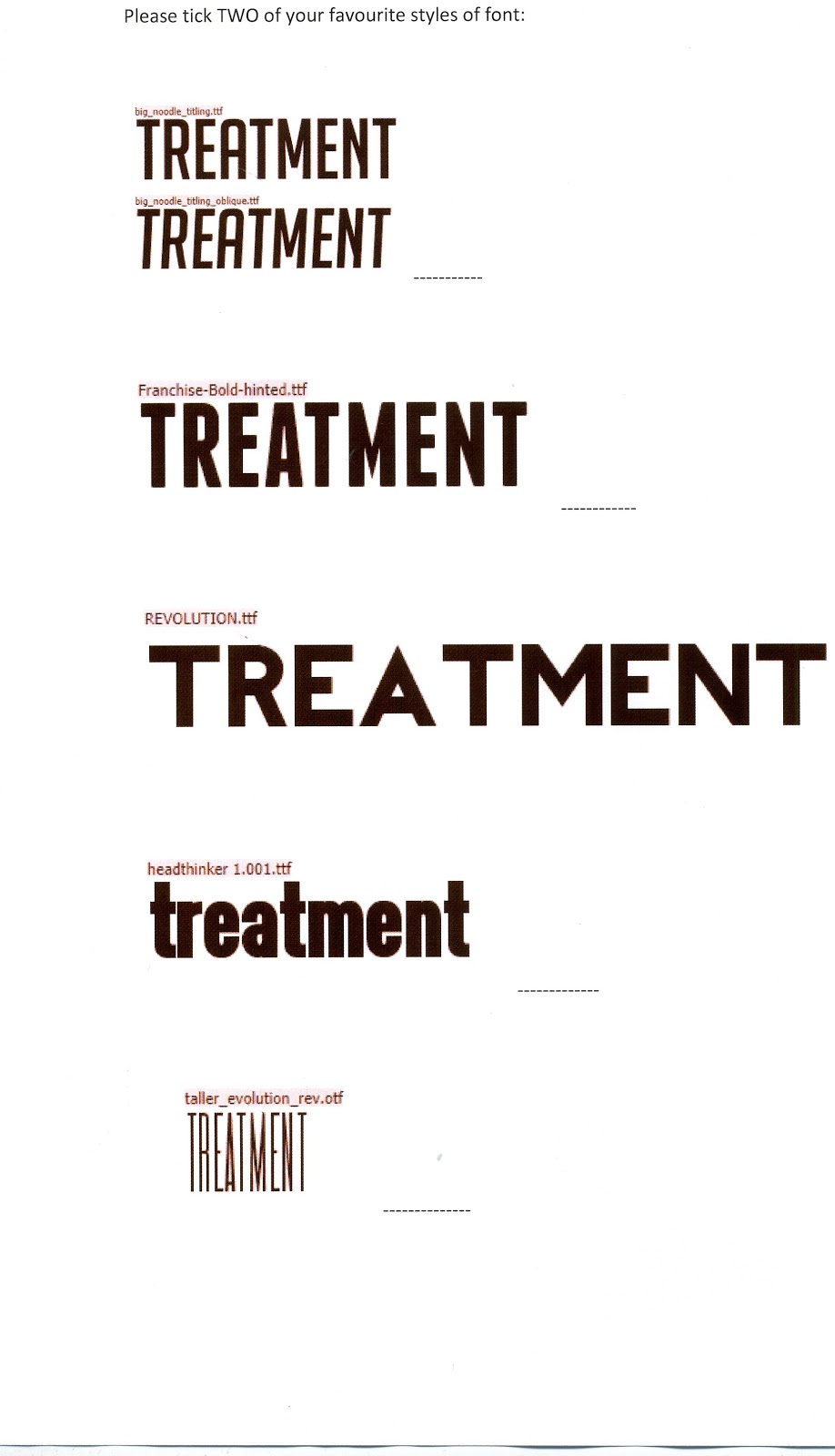
I have chosen 5 possible different styles of text that I might use for the digipak, I would preferably like to use two of these; one for the name of the album, and the other for the artists name.
1.BIG NOODLE
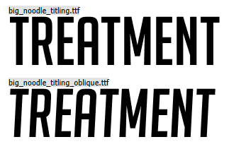
I like this text because its bold and noticeable, my favourite one out of the two is the bottom one because it is slightly slanted and I just think that it looks pretty cool.
2.FRANCHISE
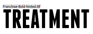
This is very similar to the one above, however, I like this one because the outline of the letters are a lot sharper and defined.
3.REVOLUTION

This text is very spaced out and the letters are very sharp too, I like how the text is bold and clear all at the same time.
4.HEADTHINKER

This is probably my least favourite one because the text is always in lowercase letters and I would preferably like to have the text in capital letters, apart from the fact that again it is very similar.
5.TALLER EVO

This text is completely different as it is skinny and squashed together, yet I personally think that it looks quite good.
I have given my opinions on the different styles of text for the front cover, however it is down to the audience feedback to tell me which they prefer!
Audience feedback on style of text:
To ask the audience I created a little questionnaire and asked them to tick the boxes of their TWO favourite styles of font and then sign their name as proof that it is real audience feedback and not made up.
Audience Feedback/Results:
In total I asked 14 people which their two favourite were and these were the results, there is an example of one of the answered questionnaires below and the final results.
In total I asked 14 people which their two favourite were and these were the results, there is an example of one of the answered questionnaires below and the final results.

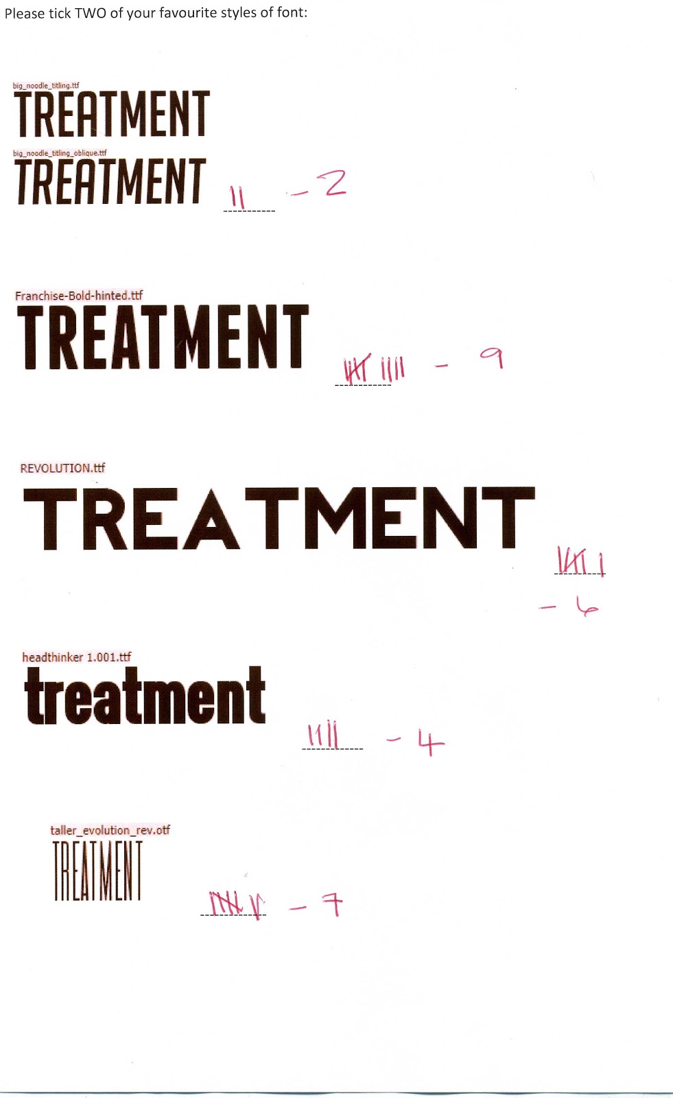
Feedback Breakdown:
1. 2/14
2. 9/14 <<<<<
3. 6/14
4. 4/14
5. 7/14 <<<<<
Fonts 2 and 5 were the chosen fonts so I then did another Questionnaire asking the public which of the fonts looked best as the artists name and which looked best as the album title. Again I got them to put their signatures next to their answers as proof the the audience feedback is real.
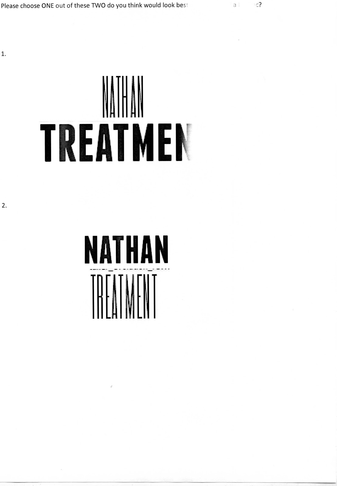
In total I asked 10 people and these were the results:

1. 4/10
2. 6/10 <<<<<
Text and Front Cover Together (options):
1. 
2.
3. 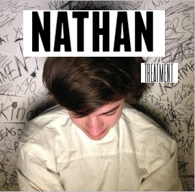
I showed the audience all 3 designs, asked them which was their favourite and took a tally down of the results. In total I asked 10 members of the public and these were the results;
1. 5/10 <<<<<
2. 3/10
3. 2/10
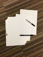
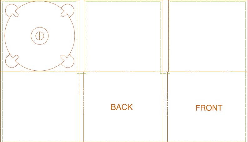
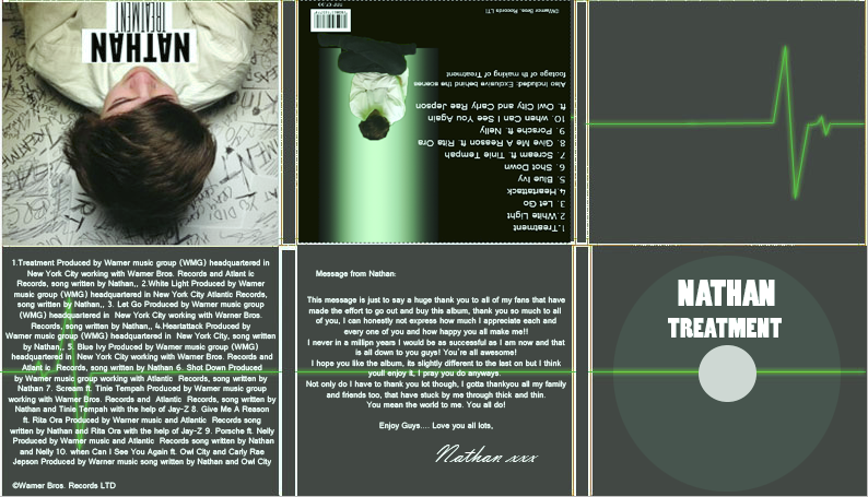
Inside/Outside of DigiPac:
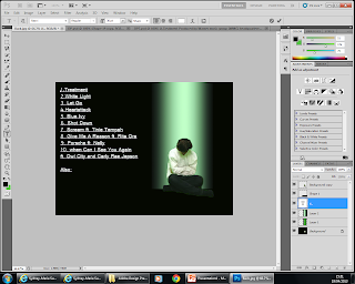
I saved a template of a digipac off the internet and used it as a guide to9 help me know where to put everything.
I saved a template of a digipac off the internet and used it as a guide to9 help me know where to put everything.
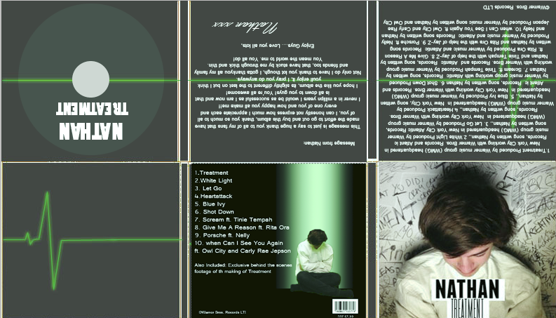
I then made the background a dark grey colour and put the green line across which is the line on a heart monitor, hence why it is green.

Then I added in the bits which represented the beat and added a green glow around and on the lines to make it look more effective.

This is how it loooked by the time I had added the effect to all of the lines.

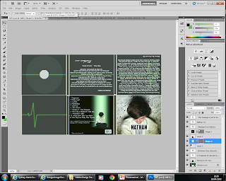
I then added on the front cover to see how it looked together and I had to resize the image to fit onto the template.

After resizing the image, this was the outcome!
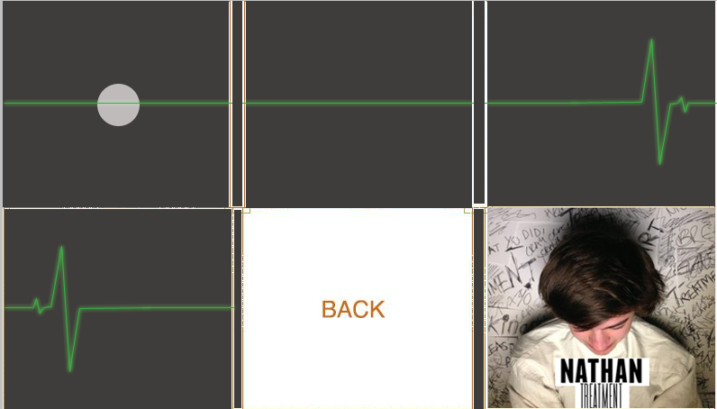
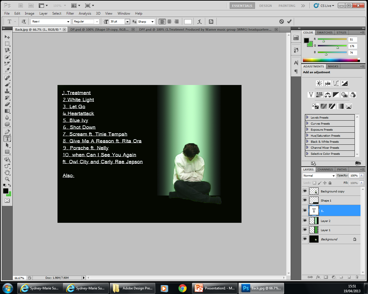
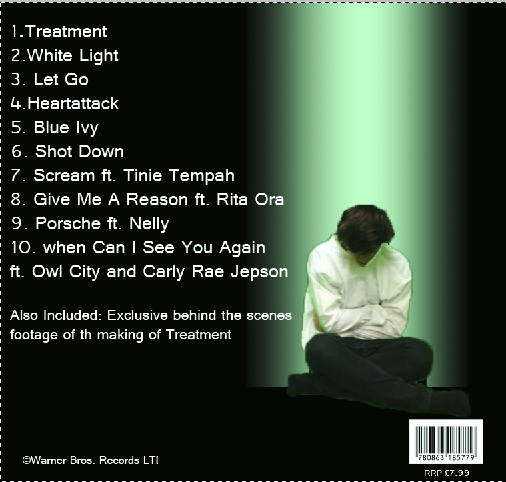
I then rotated the DigiPak round so it was upside down and added the text to it, which was the details about the songs, who produced it, who wrote the songs, what different companies helped and about the other artists that he may have worked with. Then the other was the letter from Nathan to all of his fans to tell them how much he appreciates their support and to thank his family too. I did Nathan's name in a different font to try and make it look like a signature.

Back of DigiPac:
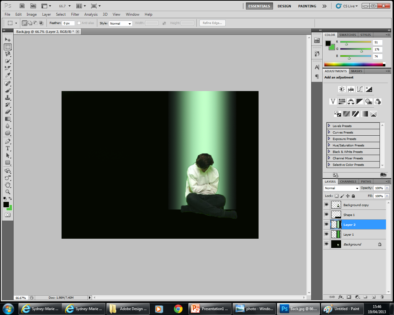
I took a picture of Nathan with him sitting in front of a green screen, that way when I uploaded it to photoshop I could select the image of the artist and colour in the rest of the background.
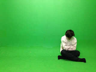


I took a picture of Nathan with him sitting in front of a green screen, that way when I uploaded it to photoshop I could select the image of the artist and colour in the rest of the background.


I then added a rectangle


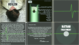
Finished Product:
No comments:
Post a Comment